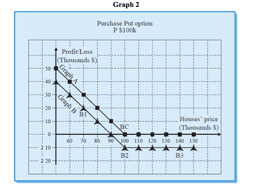
Graphic presentation of profit (or loss) from the option on date B
Graph 2 shows us the profit (or loss) on date B from purchasing a Put option for $100K on houses.
We paid $10K for the option.
From Graph 2 we can see that our transaction profit increases as house prices go down.

Graph A shows what our profit would be just on the option itself, on date B (gross profit), with respect to any market prices prevailing on that date.
(Graph A does not descend below the $0 Graph , which means that we cannot lose on the option if we had received it free of charge).
Graph B shows us the profit or loss on the transaction as a whole (net profit), for the levels of prices. Graph B takes into account the payment made in respect of the premium.
For example, point B1 shows us that we will make a profit of $20K on the transaction, it price of houses goes down to $70K.
Point B2 shows that we would lose $10K on the transaction, if the price of houses is $100K.
If the price of houses goes up to $140K, our loss will be $10K, as can be seen at Point B3, which means that we never lose more than $10K, which is the cost of the premium.
From Point B2 leftwards, any decrease of $1K in the price of houses gives us an addition $1K. At point BC we have covered the premium expense and we are “balanced”. This is the break-even point.
For any additional decrease of $1K, we make of profit of $1K.


