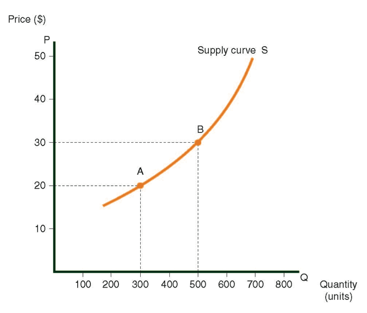
The term “supply” refers to the supply of products to the market of buyers. The market supply curve (an example of which is shown in the following diagram) displays the quantities of a specific product (in units), which producers in a country are willing to supply at any given market price.
The curve shows the supply of trousers in Country A. We will learn how to read the market supply curve later and we will examine the national trouser supply from the producers’ point of view. For now, keep in mind that as market prices climb higher, producers will want to produce more trousers to sell to the market.
In practice, consumers wishing to buy new trousers determine the price in Country A. It will be seen later that as their eagerness to buy trousers grows, the price rises, and producers produce more trousers to supply this demand. This simple statement expresses the essence of this entire chapter.
Supply of trousers in Country A

Symbols:
-
The letter S symbolizes the curve itself (Supply).
-
The letter Q symbolizes the X-axis (Quantity).
-
The letter P symbolizes the Y-axis (Price).
In a market supply curve:
-
The X-axis indicates the quantity of goods.
-
The Y-axis indicates the price of goods.
The supply curve slopes upward from left to right.
Connection between the curve and the axes:
Every point on the curve stands for two numbers:
-
Quantity (on the X-axis).
Price (on the Y-axis).
How to read the supply curve
There are two ways to read a supply curve. They are both connected, and in fact represent alternative views of the same data. The explanations refer to the supply of trousers curve.
At point A:
- Version 1: Producers are willing to produce 300 pairs of trousers if the price per pair is $20.
- Version 2: If the price for a pair of trousers is $20, then producers are willing to produce 300 pairs of trousers, and no more. They will not make 301 pairs, because the 301st pair costs more than $20 to manufacture.
At Point B:
- Version 1: Trouser producers are willing to produce 500 pairs of trousers if the price per pair is $30.
- Version 2: If the price for a pair of trousers is $30, then producers are willing to produce 500 pairs of trousers, and no more. They will not produce 501 pairs, because the 501st pair costs more than $30 to manufacture.
Meaning of the Supply Curve
The supply curve shows that as the price of trousers rises, producers will supply more trousers. (This is due to diminishing returns, as explained in the introduction of the course.)
For example, if the cost of manufacturing the 25th pair of trousers is $15, producers will be willing to sell only 25 trousers when the market price per pair is $15, since the cost of making each of those 25 trousers is less than $15.
The 26th pair, however, costs more than $15 to manufacture. The sale of the 26th pair (when the market price is $15) will therefore cause the producer to lose money.
Data Used to Draw the Supply Curve
In order to draw the curve, we need data relative to the production costs of a single pair of trousers.
As mentioned previously, these costs rise as more pairs of trousers are produced.
A Supply Curve for the Sector
An aggregate supply curve is derived by using the data from all of the companies producing trousers in a given country. It indicates the total numbers of trousers that all firms supply at a given market price.
For example, the following diagram demonstrates that at $5 per pair of trousers:
- Company A will sell 10 pairs.
- Company B will sell 20 pairs.
- Company C will sell 5 pairs.
- At $5 per pair, the supply of trousers will therefore total 35 pairs.
The individual supply curves of the three companies producing trousers, and the combined supply curve for the sector.

Characteristics of Supply Curves
- Supply curves rise from left to right, and are concave in most instances.
- The distance of the curve from the X-axis is a function of the cost of manufacturing the product featured in the graph.
- The supply curve is particularly useful when it illustrates data for an entire sector (i.e., all producers of the item). This is called an aggregate supply curve.
- Quantities indicated on the X-axis usually refer to supply for one year; however, graphs can also be drawn for other time periods.
The Connection Between the Supply Curve and the Marginal Cost Curve
The supply curve is essentially a marginal cost curve; in other words, every marginal cost curve for a product also constitutes a supply curve for that product. Every point on the supply curve displays the cost of manufacturing the marginal product at that level of production.
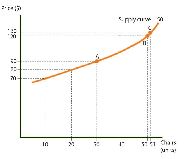
For example, in the diagram, point A on supply curve S0 indicates that the marginal cost to manufacture the 30th chair is $90. Keep in mind that the marginal cost to manufacture the 30th chair relates to the cost of producing that specific unit independent of those produced before it. Point B illustrates that the marginal cost to manufacture the 50th chair is $120.
If producers sell 50 chairs at $120 each, they will make a small profit on the 49th chair and no profit on the 50th chair. The profit per chair decreases as production nears the 50th unit:
- A $50 profit ($120 – $70) is earned on the 10th chair.
- A $40 profit ($120 – $80) is earned on the 20th chair.
- A $20 profit ($120 – $100) is earned on the 30th chair.
The 51st chair will obviously not be sold for $120, because the cost of making that specific unit would be $130, which would result in a $10 loss.
Supply curve for chairs in Country A
Horizontal Supply Curve (i.e., Elastic Supply Curve)
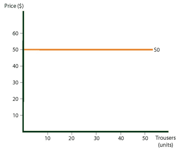
A supply curve is considered to be “elastic” when an increase in the amount of trousers produced does not affect the cost to manufacture them.
In the following diagram, the expense of producing the first pair of trousers is $50, which is the same as the cost to produce the 10th, 20th, and 50th pairs.
Supply curve for trousers in Country A
Total Production Expense for a Given Quantity of Goods
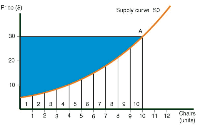
In the following diagram, the total production expenses for producing Y chairs is the amount Y, which can be seen by following the horizontal lines from 1 to Y.
Economists use these graphs to demonstrate total production expenses. In this case, the area below the supply curve is indicated from S0 to point A. If all the X axis data is charted very closely together, then the dots will form a continuous line.
Revenue
The term revenue denotes the total money value of sales during a specific period.
Examples of this include:
- Monthly revenue for the shoe sector – $100 million.
- Annual revenue of the Hamerhut Company – $50 million.
- Daily revenue of the Microsoft company – $1 billion.
Revenue at point A:
Revenue at point A totals $300, which can be calculated by multiplying the quantity by the price per unit (10 chairs x $30). Using the following diagrams, we illustrate that revenue is represented by the rectangle formed by points 0, 30, A, and 10.
Total profit from Production of a Given Quantity of Goods:
At point A, the manufacturer’s profit reflects total revenue, minus expenses. In the following diagram, profit is represented by the shaded area between the supply curve and the horizontal line connecting point A with the Y-axis.
Shift in the supply curve
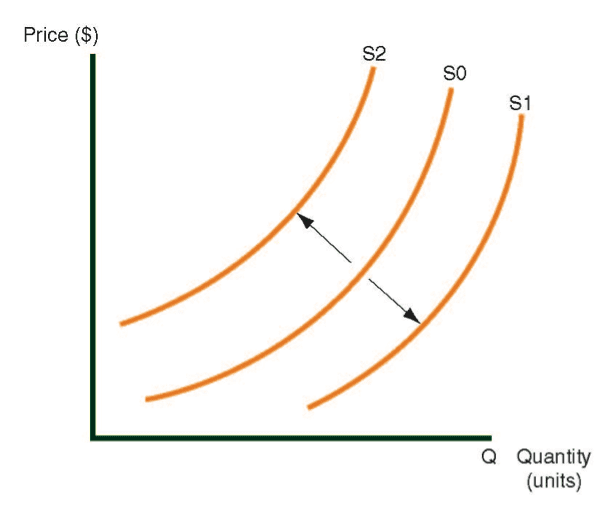
The phrase shift in the supply curve is used when the original curve (in this case, S0) no longer reflects the current state of supply, and a new curve, S1, takes its place. Diagram 5.6 shows three supply curves.
Shift in the supply curve
The direction of the shift in the supply curve
Two phrases are used to describe the position of the new curve, compared with the old one:
- Above or below the old curve.
- Left or right of the old curve.
When the shift is from S0 to S1, we say that the curve has shifted right or downwards.
When the shift is from S0 to S2, we say that the curve has shifted left or upwards.
Variables that cause shifts in the curve
Many variables can cause a shift in the supply curve, including changes in the price of raw materials and changes in wages. The following two examples concern shifts in the curve resulting from an increase in these factors. A drop in these two factors has the opposite effect of that discussed in the examples.
Example 1
Raw materials become more expensive
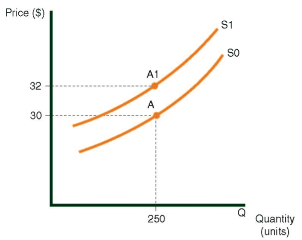
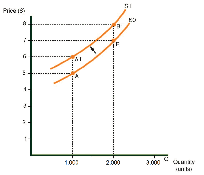
Diagram displays the sector supply curve for the production of trousers. An increase in the price of fabric will cause the supply curve to shift upwards, because the higher price of fabric increases the cost of making trousers. In Diagram the increase is equal to $1. Given the higher cost of raw materials, Curve S0 will rise by $1 at all points. Curve S1, which is $1 higher than S0, replaces S0. In other words, regardless of what quantity of trousers is produced, the price of trousers is $1 higher. The phrase “the curve shifts upward by $1” means that every point on the curve S0 rises by $1. Point A1 on curve S1, which is $1 higher, replaces Point A.
An upward shift in the supply curve of trousers, caused by higher raw material costs
Example 2
An increase in employees’ wages
Diagram displays a sector supply curve for the production of chairs. An increase in employees’ wages will cause an upward shift in the curve. The reason is that higher wages increase the cost of making chairs by $2, as shown in Diagram As a result, the S0 curve shifts upwards by $2. In other words, the new S1 supply curve is $2 higher than the old S0 curve. Regardless of what quantity of chairs is produced, the price per chair is $2 more than before. Instead of $30 per chair at point A on curve S0, the price after the wage increase is $32, represented by Point A1 on S1, the new supply curve.
Key
Cost of the product – The total expenses incurred in making the product.
Price of the product – The amount that the consumer pays for the product.
An upward shift in the supply curve for chairs caused by a wage increase
